








🌊 The origin of the logo of Starbucks is deeply connected with the sea, maritime adventure, and the history of coffee trading 🚢. When Starbucks was founded in 1971 in Seattle, the founders wanted a logo that reflected the city’s strong relationship with ships, ports, and global trade ⚓. Seattle was historically known as a gateway for imported coffee beans arriving from distant countries 🌍. The founders searched for an image that represented mystery, attraction, and exploration. After studying old marine books and historical artwork 📜, they discovered an ancient twin-tailed siren illustration. This mythical sea creature became the inspiration behind one of the most famous business logos in the modern world ✨.
🧜♀️ “The green siren of Starbucks attracts people not only to coffee, but also to comfort, conversation, and creativity.” ✨
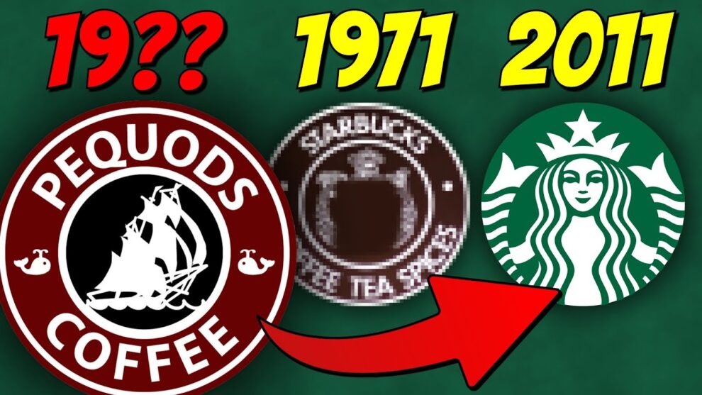
📖 The history of the Starbucks logo began with three founders: Jerry Baldwin, Zev Siegl, and Gordon Bowker ☕. They wanted their coffee business to feel unique and memorable rather than ordinary 🏪. The name “Starbucks” itself was inspired by the character Starbuck from the famous novel Moby-Dick 📚. Since the novel was closely related to the sea and adventure, the founders believed a maritime-themed logo would perfectly match the company name 🌊. The first logo was brown and featured a highly detailed twin-tailed siren surrounded by the words “Starbucks Coffee Tea Spices” 🤎. This design reflected both tradition and artistic creativity during the early years of the company 🎨.
🧜♀️ The authenticity of the Starbucks logo comes from its historical and mythological roots 📜. The siren image was not randomly created; it was inspired by a real Norse-style woodcut illustration from the 16th century 🌍. In ancient mythology, sirens were believed to attract sailors with enchanting songs across the seas 🚢. Starbucks adopted this symbolism to represent how the aroma and flavor of coffee could attract customers into the café ☕. The company carefully preserved the original concept even while redesigning the logo over time. This authentic connection to history and mythology gave the Starbucks logo a sense of timelessness and uniqueness compared to ordinary commercial logos 🌟.
🎨 The person most associated with shaping the original Starbucks logo was designer Terry Heckler 🖋️. He worked closely with the founders to transform the old maritime illustration into a recognizable business identity 💡. Heckler believed the logo should feel historical yet powerful enough for modern branding. He refined the siren image while keeping its mysterious and adventurous appearance 🧜♀️. His design work helped create a logo that customers would remember instantly. Over decades, even after multiple redesigns, the core siren image remained unchanged, proving the strength of the original artistic vision 🎯.
🏗️ The implementation of the Starbucks logo was carefully connected with customer experience and business identity ☕. In the early days, the logo appeared on coffee bags, storefront signs, cups, menus, and advertisements 📦. Customers walking into Starbucks stores immediately noticed the unusual maritime symbol instead of a common coffee-related image 👀. This created curiosity and discussion among visitors 💬. As Starbucks expanded internationally, the company simplified the design and changed the color from brown to green 💚. The green version symbolized freshness, growth, and prosperity 🌿. Through consistent implementation across stores worldwide, the logo became a universal symbol of premium coffee culture 🌎.
💬 People’s views about the Starbucks logo have always been interesting and diverse 🌍. Many customers admire the siren as a symbol of comfort, relaxation, and café lifestyle ☕. Others see it as a representation of adventure, creativity, and global connection 🚢. Some discussions have focused on the mythological meaning of the siren, while marketing experts praise Starbucks for creating one of the strongest brand identities in business history 📈. Even critics who questioned the unusual design admitted that the logo was unforgettable 👁️. The public discussions surrounding the siren increased curiosity about the brand and helped Starbucks become more recognizable around the world 🌟.
🚀 Today, the Starbucks logo is considered one of the most successful and influential logos ever created 🏆. What started as a detailed brown siren in a small Seattle coffee shop eventually transformed into a globally recognized green symbol 🌎. Millions of people instantly recognize the logo even without seeing the company name 👀. Business schools and branding experts often study Starbucks to understand how storytelling, authenticity, and visual identity can drive massive business growth 📘. The logo’s origin, historical inspiration, and emotional connection with customers continue to make Starbucks one of the strongest brands in the international coffee industry ☕✨