






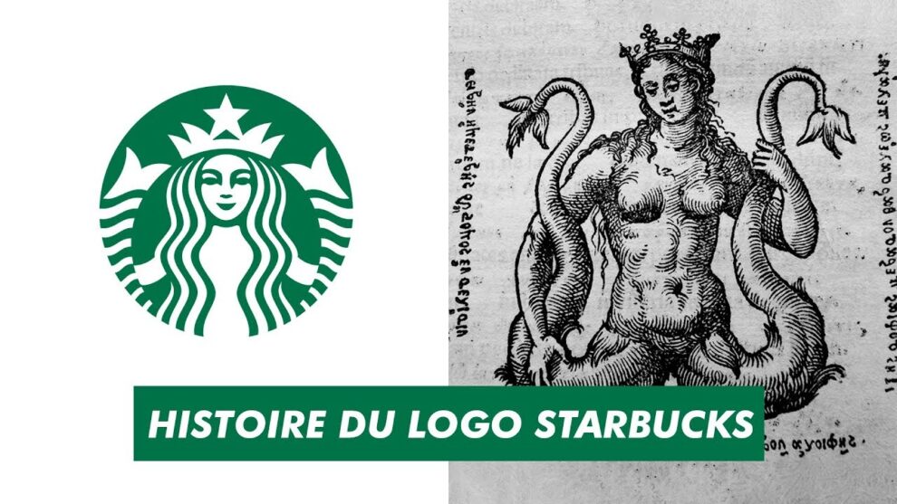


☕ The logo of Starbucks carries a deep symbolic meaning that goes far beyond coffee 🌍. The famous green siren represents attraction, mystery, and adventure 🧜♀️. Inspired by ancient maritime mythology, the twin-tailed siren symbolises the power to attract sailors from distant seas 🚢. Starbucks used this image to express how the aroma and taste of coffee can attract people from all walks of life ☕. The company wanted customers to feel drawn toward the café experience in the same way sailors were drawn toward mythical songs of the sea 🌊. This creative meaning transformed the Starbucks logo into one of the world’s most recognizable symbols in modern business branding ✨.
☕ “The Starbucks logo is more than a symbol — it is a story of coffee, culture, and global connection.” 🌍
🎨 The history of the Starbucks logo began in 1971 in Seattle 🏙️. The founders searched for a design connected to coffee trading history and the city’s strong maritime culture ⚓. They discovered an old Norse-style woodcut image of a twin-tailed siren in a vintage marine book 📜. This ancient artwork became the inspiration for the first Starbucks logo. Originally, the logo was brown instead of green 🤎. Around the siren were the words “Starbucks Coffee Tea Spices,” showing that the business sold more than just coffee ☕. Over time, the logo evolved into a cleaner and more modern design while still preserving the original siren image 🌿.
👨💼 The implementation of the Starbucks logo was carefully planned to build a strong emotional connection with customers ❤️. From the beginning, the logo appeared on store signs, coffee cups, packaging, menus, and advertisements 📦. The company understood that visual identity could influence how customers remembered a brand 🧠. Instead of using a simple coffee bean or cup symbol, Starbucks chose a mythical figure that created curiosity and discussion 💬. This unique implementation helped customers instantly recognize Starbucks stores even from a distance 👀. As the company expanded internationally, the logo became a universal symbol of premium coffee culture and café lifestyle 🌎.
🌱 During the 1980s and 1990s, Starbucks redesigned its logo several times to support business growth 📈. When Howard Schultz expanded the company globally, he wanted the logo to feel modern, welcoming, and easy to identify worldwide 🌍. The brown color was replaced with green, symbolizing freshness, prosperity, and growth 💚. Designers simplified the siren’s appearance so it could work better on digital platforms, cups, and advertisements 🖥️. The implementation of a cleaner logo helped Starbucks enter malls, airports, universities, and international markets more effectively ✈️. The updated design maintained historical identity while adapting to modern branding trends ✨.
💬 The Starbucks logo has also generated many discussions and interpretations around the world 🌎. Some people see the siren as a symbol of temptation and luxury coffee culture ☕, while others view it as an artistic connection to ancient mythology 📚. Marketing experts often discuss Starbucks as one of the greatest branding success stories in business history 🏆. The logo became more than a company mark; it turned into a cultural icon associated with social gatherings, relaxation, and urban lifestyle 🏙️. Even people who do not regularly drink coffee can often recognize the green siren instantly 👁️. This strong public discussion increased the company’s visibility and brand power across generations 🌟.
🚀 The Starbucks logo played a huge role in helping the business grow into a global empire 🌍. Strong branding created trust and familiarity among customers, encouraging repeat visits ❤️. As Starbucks expanded into hundreds and then thousands of stores worldwide, the logo acted as a consistent identity across different countries 🌐. Whether customers visited a Starbucks in the United States, Europe, Asia, or the Middle East, the siren logo gave a sense of familiarity and comfort ☕. This visual consistency strengthened customer loyalty and helped Starbucks compete successfully against local coffee shops and international chains 📈.
🌟 Today, the Starbucks logo represents far more than coffee alone ☕. It symbolizes modern café culture, innovation, business success, and global connection 🌎. Companies around the world study Starbucks branding strategies to understand how a simple symbol can create emotional attachment and international recognition 📘. The logo’s journey from a detailed brown siren to a modern green icon demonstrates the importance of adapting while preserving history 🧜♀️. Through smart implementation, meaningful storytelling, and strong visual identity, Starbucks transformed its logo into one of the most powerful business symbols in the world today ✨