






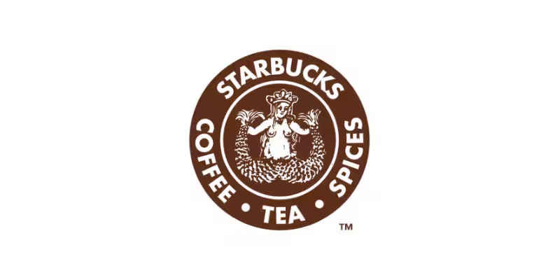


☕ The first logo of Starbucks is one of the most fascinating stories in modern branding history 🌍. When the company started in 1971 in Seattle, the founders wanted a symbol that reflected the mystery and adventure of the sea 🚢. Since Seattle was a historic port city connected to coffee trading routes, they searched for an image that represented maritime culture and exploration 🌊. After exploring old marine books, they discovered a twin-tailed siren from a 16th-century Norse woodcut illustration 📜. This ancient mermaid figure became the foundation of the original Starbucks logo and helped create a unique identity that people could instantly recognize worldwide ⭐.
🌿 “A powerful logo can transform a small coffee shop into a worldwide business empire.” 🚀
🎨 The original Starbucks logo looked very different from the modern green symbol people know today 💚. The first design was brown in color and featured a detailed twin-tailed siren with long flowing hair 🧜♀️. Around the image, the words “Starbucks Coffee Tea Spices” were written in a circular format ☕. The brown color was chosen to represent warmth, earthiness, and the rich nature of coffee beans 🌱. Unlike today’s simplified branding, the early logo had a vintage artistic appearance inspired by old nautical drawings ⚓. This unusual design helped Starbucks stand apart from ordinary coffee shops and created curiosity among customers from the very beginning ✨.
👨💼 The founders of Starbucks were Jerry Baldwin, Zev Siegl, and Gordon Bowker 🏪. Among them, Gordon Bowker played an important role in branding and naming the company 🖋️. The name “Starbucks” was inspired by a character called Starbuck from the famous novel Moby-Dick 📚. The founders believed the name sounded adventurous and connected well with the seafaring history of coffee trade 🚢. A professional designer named Terry Heckler helped create and refine the first logo 🎨. His artistic work transformed an ancient maritime image into one of the most recognized business symbols in the world 🌟.
🏗️ The implementation of the first Starbucks logo was carefully connected with the company’s vision and store atmosphere ☕. In the early years, the logo appeared on shop signs, coffee bags, cups, menus, and advertisements 📦. The founders wanted customers to feel that Starbucks was not simply a place to drink coffee, but a gateway to premium coffee culture 🌍. The siren logo symbolized attraction and temptation, similar to mythical sea legends 🧜♀️. Customers walking past the store would immediately notice the unusual design and become curious about the brand 👀. This creative implementation helped Starbucks build a memorable identity long before social media or digital marketing existed 💡.
☕ “Starbucks proved that strong identity and customer experience can build loyalty across generations.” 💚
🌱 As Starbucks expanded during the 1980s, the company decided to modernize the logo for a wider audience 🌎. When Howard Schultz joined and later purchased the company, he envisioned Starbucks as a global coffee experience ☕. In 1987, the logo was redesigned with a green color instead of brown 💚. The siren image became cleaner and less detailed, making it easier to print and recognize worldwide 🖨️. Green was selected because it symbolized freshness, growth, and prosperity 🌿. Even though the design evolved over time, the company kept the siren because it represented the heart and heritage of Starbucks history 📖.
📈 The first Starbucks logo also played a major role in building customer loyalty and emotional connection ❤️. Many people associated the siren with quality coffee, comfort, and a relaxing café environment ☕. Unlike ordinary restaurant logos, Starbucks used storytelling and mythology to create a deeper identity 📚. The logo became a symbol of premium coffee culture and urban lifestyle 🏙️. Over decades, millions of customers across different countries recognized the siren instantly 🌍. This strong branding strategy helped Starbucks become one of the most successful coffee companies in history 🚀.
🌟 Today, the evolution from the first Starbucks logo to the modern design is considered a legendary example of branding success 🏆. Business schools and marketing experts often study Starbucks to understand how a simple logo can create global recognition 📘. The original brown siren logo represents the humble beginnings of a small Seattle coffee shop, while the modern green version represents international success 🌎. Despite many design updates, Starbucks preserved its historical identity by continuing to use the siren symbol 🧜♀️. This balance between tradition and innovation is one reason why Starbucks remains one of the most influential coffee brands in the world today ☕✨